
Pop culture
Finding Nemo and the Many Moods of Water
Historical event:
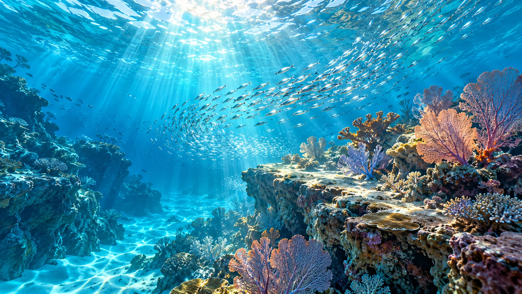
How do you make an ocean feel enormous, a reef feel like home, and a fish tank feel confining when all three are full of water?
Finding Nemo made that visual question part of its storytelling. On May 30 in 2003, the Pixar film arrived in theaters, sending Marlin across an animated ocean in search of his son. Andrew Stanton directed the story, with Dory joining the anxious father's journey.
The setting was more than an attractive blue backdrop. Different places needed different emotional temperatures. A bright reef could feel welcoming, while a darker expanse could make two small fish look suddenly very small indeed.
The ocean had a color script
Pixar's own account describes production designer Ralph Eggleston using a color script to plan that progression. These sequences of small drawings or paintings establish the visual language of scenes. For Finding Nemo, vivid reef colors gave way to a more restrained, ominous palette as the journey reached deeper water.
Lighting posed its own puzzles. In the whale sequence, lighting director Sharon Calahan describes the team inventing a plausible-looking way for light to enter an otherwise dark environment. The task was to help the audience follow the characters and feel the setting. Film design was making choices on behalf of the story.
Pixar also recalls early reef tests looking so realistic that the team leaned further into stylization. Believability had to leave room for make-believe. Talking fish needed an underwater world with enough visual logic to draw viewers in and enough artistic freedom to carry the adventure.
That balance is easy to appreciate on a second viewing. Color, visibility, and the space around a character quietly suggest how to feel before the dialogue catches up. The water has no single mood. Its appearance changes with the story's needs.
The result rewards a second kind of attention: watch the setting while following the fish. A shift in blue, a patch of light, or a suddenly empty expanse can carry part of the adventure without saying a word.
Back on dry land, ask what water is touching
Water can feel like the simplest possible cleaning choice. A useful workplace question comes one step earlier: which material, coating, or device are we talking about?
Apple's current care guidance, for example, says to keep moisture out of product openings and gives different directions for particular products. That is a concrete reminder to read the relevant instructions. Familiarity with one screen does not supply the care plan for every display in a building.
Before adding damp cleaning to a scope, identify the finish and obtain its manufacturer's guidance. Flag wood finishes, coated displays, electrical equipment, and unfamiliar porous surfaces for that discussion. The outcome should be a specific agreed method or an explicit exclusion, rather than a guess based on appearance.
A short inventory of uncertain surfaces gives the business owner useful decisions to make before work begins. It also keeps the conversation focused on the actual space instead of treating every object as interchangeable.
Ready to navigate the details of your Ontario workplace? Talk with JLV about office cleaning. Let's start with the surfaces, and keep the ocean adventure on the screen.