
On this day
Sydney Opera House Opens: Why Surface Texture Matters
Historical event:
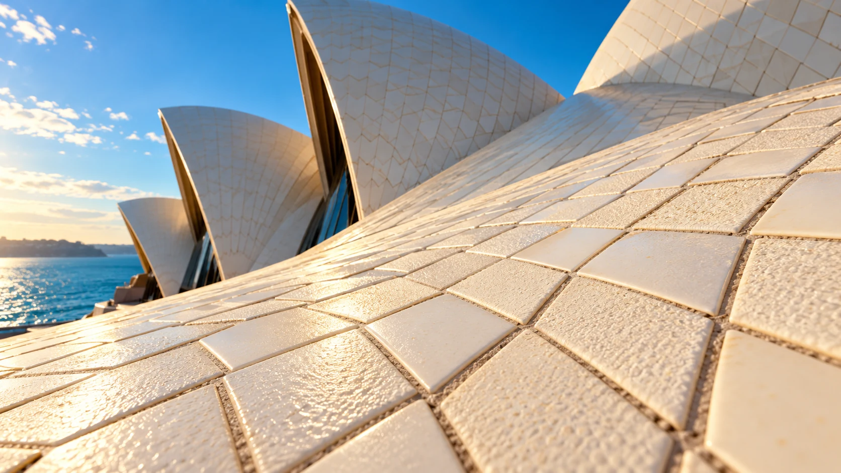
From across the harbor, the Sydney Opera House seems to be all gesture: a gathering of pale shells reaching into the sky. Move closer in your imagination and that single silhouette breaks into a much smaller story. Tiles. Joints. Texture. A carefully chosen way for light to meet a surface.
Queen Elizabeth II officially opened the building on October 20, 1973. The Opera House's own history makes an important distinction: performances had already begun before that ceremony. An official opening marks a milestone; it does not always mark the first moment a place is used.
On September 28, before the royal ceremony, the Opera Hall had staged Prokofiev’s War and Peace. Go back further and an even more unexpected performance appears: in 1960, Paul Robeson sang to construction workers from the scaffolding. The building’s musical history was taking shape while its physical form was still being made.
Those moments give the familiar harbor silhouette a human interior. The story contains people waiting to perform, people doing the work of construction, and an audience eventually entering the completed spaces. A landmark may fit neatly on a postcard; bringing it into use unfolds through many smaller scenes.
The roof's dramatic forms also had a practical turning point. Architect Jørn Utzon and his team explored several geometries before deriving the shells from a sphere. A common geometry helped make repetition and prefabrication possible. Behind the apparently free-flowing shape was a disciplined way of making the pieces relate.
Then came the question of their skin. According to the Opera House, Utzon wanted gloss without a harsh mirror effect. Japanese ceramic bowls helped inspire the desired texture, and the Swedish manufacturer Höganäs spent three years developing the tile. The result contained a small proportion of crushed stone in its clay. More than a million tiles cover the roof.
A finish has a personality
The memorable part is how much thought went into something a distant viewer might summarize with one word: white. Color alone could never describe the whole requirement. The surface needed to participate in the building's changing appearance throughout the day.
That observation travels well to a workplace. Two neighboring surfaces may share a color and still ask very different questions. A smooth panel, a textured tile, a grout line, and a painted edge can look like one design choice from the doorway. In a cleaning conversation, treating them as one unnamed area leaves too much to assumption.
Consider a reception wall that meets a tile floor. Instead of calling the whole area “the front,” make a short material map. Identify what you know, flag finishes you cannot identify, and keep the adjacent surfaces distinct in the scope. If an owner or installer has care instructions, attach those to the relevant surface rather than leaving them in a general folder nobody connects to the room.
Give the details their due
Sydney's roof proves how much character can live inside a seemingly simple finish. Your workplace deserves that same habit of looking closely, even without a harbor and an audience.
Have distinctive finishes in your Chino or Ontario office? Tell JLV about the materials that make your space yours. Let's help the details hold their own.